Good social media photos aren't just about having a great camera. A lot comes down to the decisions you make before and after you shoot — the light you use, the composition you choose, and the way you present your images once they're on your phone. Here are ten practical tips that will genuinely move the needle.
1. Chase good light, not golden hour hype
Natural light is your best friend, but you don't need to wake up at sunrise. Soft, even light near a window works beautifully for portraits, food, and flat lays at any time of day. Avoid harsh midday sun, which creates unflattering shadows, and step away from mixed artificial light that leaves skin tones looking off. When you're outdoors, overcast days are underrated — clouds act as a giant diffuser.
2. Use the rule of thirds
Turn on the grid in your iPhone camera and place your subject at one of the four intersection points rather than dead center. It sounds like a minor adjustment, but it makes photos feel more dynamic and intentional immediately. For landscapes, position the horizon on the top or bottom third rather than cutting the frame in half. Over time this becomes instinctive.
3. Keep your background clean
A cluttered background pulls attention away from your subject. Before you shoot, spend ten seconds looking at what's in the frame behind your subject and move anything that doesn't belong. Solid walls, natural textures, and uncluttered surfaces all work well. If you're shooting a product or flat lay, a plain sheet of card stock or fabric costs almost nothing and makes a huge difference.
4. Shoot more than you think you need
Professional photographers take dozens of frames to get one keeper. You should too. Shoot the same scene from several angles, try different distances, and take multiple shots of any moment you want to capture. You can always delete, but you can't go back. Having more options also makes it easier to build a cohesive collage later — you'll have shots that complement each other rather than repeating the same angle.
5. Edit consistently
Consistent editing is what gives a feed its visual identity. Pick a style — warm and bright, muted and moody, high contrast, whatever fits you — and stick to it. You don't need a complex preset; adjusting exposure, contrast, and saturation the same way each time is enough. Consistency across posts signals that you put thought into your content, which builds trust with your audience.
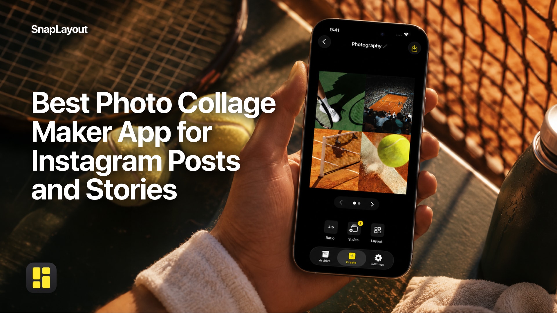
6. Choose the right format for each platform
Square posts work fine, but portrait formats (4:5 or 9:16) take up more real estate in a feed and tend to get more attention. Stories and Reels demand a full 9:16 vertical frame. Landscape images (16:9) are great for carousels where you want to show width. SnapLayout lets you switch between all of these formats without starting your layout from scratch, so experimenting costs you nothing.
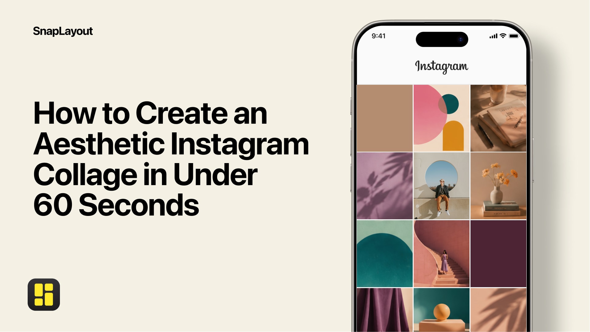
7. Use collages to tell a fuller story
A single image captures a moment. A collage captures context. Combining a wide establishing shot with a close-up detail and a candid reaction photo gives viewers a richer picture of what they're looking at — whether that's a recipe, a travel destination, or a product. SnapLayout makes it easy to arrange multiple images into a single post, so you can share more without flooding someone's feed.
8. Use carousels for depth
Instagram carousels consistently outperform single images for engagement because they give people a reason to swipe. Think of them as a mini story with a beginning, middle, and end: tease something on slide one, develop it across the next several, and land on a clear conclusion or call to action at the end. With SnapLayout you can build carousel posts up to 20 slides, which is more than enough room to tell almost any story well.
9. Keep your color palette cohesive
You don't need every post to match perfectly, but photos that share a similar color temperature and saturation look like they belong together. When you're selecting images for a collage or a carousel, check that the tones don't clash. Warm photos next to cool photos can feel jarring. A simple fix: edit all photos from a single shoot together so the adjustments stay consistent across the set.
10. Match your layout to your content
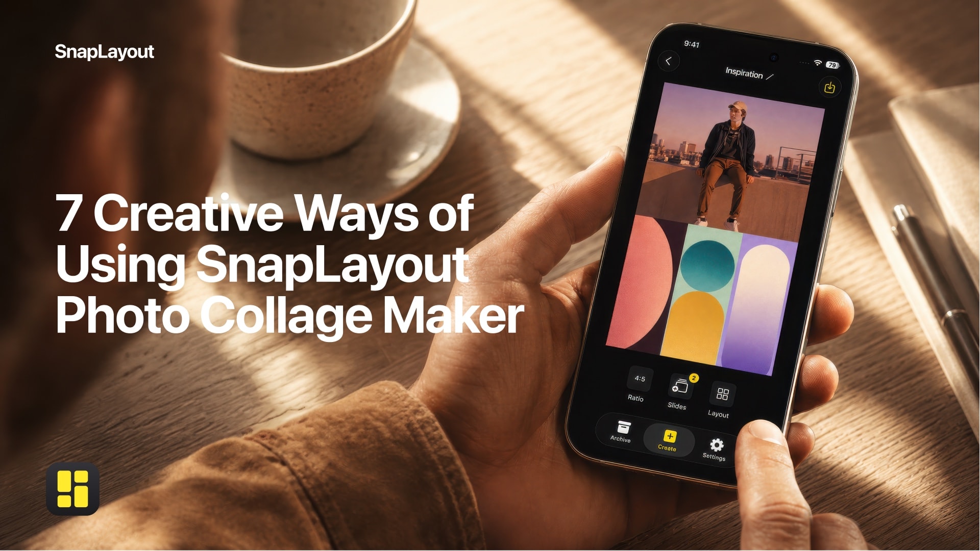
Not every set of photos calls for the same grid. A single hero image in a split layout hits differently than four equal panels. Think about what you want the eye to land on first and build the layout around that. In SnapLayout you can try different arrangements quickly — swap panels, change the grid, adjust spacing — until the composition feels right. The layout is part of the story, not just a container for it.
Better social media photos come from small, consistent improvements — not from buying a new camera. Get the light right, think about how you present images, and use tools that make the presentation side easy. The rest follows.